
The M That Turned to Gold.
The Story of Goudmunter in Three Stamps
Some brands are created. This brand has grown. It grew over three generations of the De Munter family, each with their own business.
There is one symbol that runs through the entire lineage leading to Albert De Munter and Dirk De Munter. It is not an inherited family crest, but something Dirk himself drew during his years in the artillery: the M. And this story begins and ends with that M.
I. 2006. The Blue M

In the beginning, there was blue.
Deep, pure, and unwavering blue. It was the color of current and voltage. The color of energy racing through copper wire. The color of a world where things have to work or they won’t sell. It was the color of the battery industry. Albert De Munter’s trade. The trade his son Dirk also entered. A business in power. Electricity in stock. Energy at your fingertips. Reliability as the only promise that matters.
In the center was the letter M enclosed in a blue circle. Not a logo begging for attention, but a symbol that said exactly what it was: a letter enclosed in a ring. Someone stands behind this. The family name cast into a single symbol. The foundation. The form upon which everything else would be built.
And that circle was never just decoration. The ring stood for trust. For reliability. For security. For a closed whole you can rely on. An open line lets go; a circle holds on. Whoever puts their name inside a ring makes a promise: I’ll stay. I won’t rule anything out. You’re safe with me. That’s what the blue circle has always meant. Long before anyone ever uttered the word “trust.”
And that design was no accident. Nor was it the work of a stranger. The “M” was drawn by Dirk De Munter himself—in his own hand—back when he was still in the battery business, for his own brand. From the very beginning, it was not a commissioned logo but a signature.
Because the circle was already there. The M was already there. Everything was in place. Only one thing was missing: the gold. Registered logo BIOP 1446307
II. December 2023. The Golden Edge

Then came gold.
And take a close look at what happened. Or rather, at what didn’t happen. The M remained. The circle remained. The shape he himself had drawn years earlier was never questioned for a second. Nothing was redrawn. Nothing was discarded. Nothing was reinvented.
One thing was done: the ring was gold-plated. And Dirk did that himself, too. The same hand that had drawn the blue M now turned the ring gold.
The blue of the circle gave way to gold. And in that single gesture, a small act of alchemy took place. For a blue ring is a border. A gold ring is a coin.
That goes to the heart of the name itself. Traditionally, a “munter” was not a spectator but a craftsman: the master mint master. The one who weighed and inspected precious metals and struck them into coins of value. For generations, the family bore that name without practicing the craft. And it was precisely at that moment that the blue ring turned gold. That was when De Munter finally became what his name had always promised: a gold mint master. Someone who weighs and appraises gold and assesses its value.
The past was not denied. It was recast. The same M. The same circle. The same foundation from the world of batteries. But now cast in gold. The coin that emerged carried its entire history within it. And the meaning remained as well: the ring still stood for trust. Only now in the most stable form that exists. Trust in gold. Continuity that was visible to the naked eye.
III. July 2025. The Seal
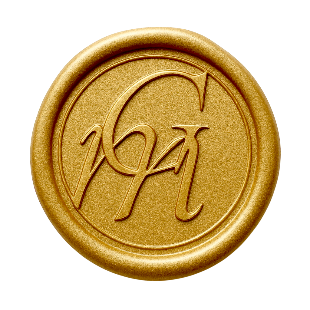
And finally, a brand comes of age.
For nearly twenty years, Dirk had held his own brand in his hands. Literally: from the blue “M” to the gold coin, every design was his own creation. But a brand that has come of age also knows when to let go. For this step, the design was entrusted to studio M+A—not because Dirk could no longer do it himself, but because a mature brand knows when to let a master refine its signature.
The bold coin gives way to something quieter and more reassuring: a wax seal. A trust seal. Not a color that screams, but an imprint that whispers. Subtly and carefully woven into the seal: the Gm monogram. The G for gold and the small m for “munter.” The two letters that sum up the entire journey. Immortalized in a single elegant symbol.
This is no longer a brand that has to prove itself. This is a signature. The mark you place on something you stand for—on trust, authenticity, and value. You don’t just say “seal”; you bestow it. It’s the mark of someone who no longer needs to make a claim, because by now, their name speaks for itself.
Refined. Clear. With a touch of allure. A detail that speaks without words. And that is precisely where its power lies.
And see how the circle closes. What began in 2006 as a blue ring of trust and became a gold coin in 2023 was given its true name here: a trust seal. A seal of trust. The promise that the circle had silently carried all those years is now literally embedded in its name. Eighteen years later, the symbol has finally come home to its true meaning.
The common thread
Three generations of the De Munter family in business. First cars. Then batteries. Then gold. Different merchandise each time, but always the same promise: honest work, fair value, and your word as the only guarantee.
And throughout it all, the “M” appeared. Drawn by the same hand—that of Dirk De Munter. Third generation.
From the battery to the coin. From blue to gold. From a letter to a seal. And always that ring around it: the circle of trust that never broke.
The M never disappeared. It just became a little richer with each generation. Until it finally became what it was always meant to be: gold.